design system V3:
scaling with tokens & ai
design system V3:
scaling with tokens & ai
design system V3:
scaling with tokens & ai
01
CREHANA
TOKENS
AI
How I evolved a Design System from basic UI standardization into a scalable, code-aligned and AI-assisted design infrastructure.
How I evolved a Design System from basic UI standardization into a scalable, code-aligned and AI-assisted design infrastructure.
Role:
Design System Designer
Role:
Design System Designer
Company:
Crehana, HR Platform
Company:
Project for a MicroDegree in UX Design
Collaboration:
Product Design & Frontend Engineering
Collaboration:
Product Design & Frontend Engineering
Timeline:
2025-2026
Timeline:
2025-2026

Overview
Overview
In 2023, I helped evolve our Design System to bring consistency, accessibility and structure to a growing product across Web and Mobile.
As the product expanded into Enterprise B2B SaaS, new challenges emerged: multi-brand customization, scalable token architecture and stronger Design–Engineering alignment.
This led to Design System V3 — an evolution focused on making the system more scalable, adaptable and AI-ready.
In 2023, I helped evolve our Design System to bring consistency, accessibility and structure to a growing product across Web and Mobile.
As the product expanded into Enterprise B2B SaaS, new challenges emerged: multi-brand customization, scalable token architecture and stronger Design–Engineering alignment.
This led to Design System V3 — an evolution focused on making the system more scalable, adaptable and AI-ready.
The goal
The goal
Transform the Design System from a UI library into an infrastructure capable of supporting:
Multiple brands · Multiple contexts · Multiple workflows
Transform the Design System from a UI library into an infrastructure capable of supporting:
Multiple brands · Multiple contexts · Multiple workflows
From V1 to V3
The system wasn't rebuilt from scratch.
It evolved as the product evolved.
Create consistency
V1 — Establish
The first version focused on solving fragmentation and standardizing the UI.
Foundations
Components
Accessibility
Documentation
Create scalable foundations
V2 — Systematize
The next step was to move from individual UI values toward reusable primitives and a closer relationship between Design and Frontend.
Primitive tokens
Spacing scales
Variables
Frontend alignment
Make the system adaptable
V3 — Scale
The latest evolution introduced a semantic architecture capable of supporting Enterprise requirements and AI-assisted workflows.
Semantic architecture
White Labeling
Contextual theming
Markdown documentation
AI-assisted workflows
From V1 to V3
The system wasn't rebuilt from scratch.
It evolved as the product evolved.
Create consistency
V1 — Establish
The first version focused on solving fragmentation and standardizing the UI.
Foundations
Components
Accessibility
Documentation
Create scalable foundations
V2 — Systematize
The next step was to move from individual UI values toward reusable primitives and a closer relationship between Design and Frontend.
Primitive tokens
Spacing scales
Variables
Frontend alignment
Make the system adaptable
V3 — Scale
The latest evolution introduced a semantic architecture capable of supporting Enterprise requirements and AI-assisted workflows.
Semantic architecture
White Labeling
Contextual theming
Markdown documentation
AI-assisted workflows
The Challenge
The Challenge
As the product matured, four new problems became increasingly important.
As the product matured, four new problems became increasingly important.

Enterprise customization was difficult to scale
Customers needed dashboards adapted to their visual identity, but each customization required additional work and duplication on the Engineering side, making the White Label model difficult to scale.
Enterprise customization was difficult to scale
Customers needed dashboards adapted to their visual identity, but each customization required additional work and duplication on the Engineering side, making the White Label model difficult to scale.

Tokens needed a stronger abstraction
Components shouldn't depend directly on visual values. They needed to consume tokens based on meaning and function.
Tokens needed a stronger abstraction
Components shouldn't depend directly on visual values. They needed to consume tokens based on meaning and function.

Design and code needed one language
As the system grew, inconsistencies between Figma, documentation and implementation created unnecessary friction during handoff.
Design and code needed one language
As the system grew, inconsistencies between Figma, documentation and implementation created unnecessary friction during handoff.

Documentation needed to become actionable
Complex components required information beyond their visual appearance: Anatomy
Spacing, Behavior, Accessibility, Markup, Implementation rules
Documentation needed to become actionable
Complex components required information beyond their visual appearance: Anatomy
Spacing, Behavior, Accessibility, Markup, Implementation rules
The Architecture
The Architecture
The central change in V3 was introducing a clear separation between values and meaning.
Instead of allowing components to consume raw values, the system was structured into layers.
The central change in V3 was introducing a clear separation between values and meaning.
Instead of allowing components to consume raw values, the system was structured into layers.

A Component-First Token Language
A Component-First Token Language
To make the semantic layer predictable and scalable, we established a component-first naming convention.
Instead of naming tokens after their visual value, each token describes where it belongs, what it controls and, when necessary, which variant or state it applies to.
To make the semantic layer predictable and scalable, we established a component-first naming convention.
Instead of naming tokens after their visual value, each token describes where it belongs, what it controls and, when necessary, which variant or state it applies to.

A simple example
A simple example
Take the background of a primary button:
Take the background of a primary button:
button-bg-primary
Descargar reporte
brand-50
The component doesn't need to know which specific color to use. It only knows that it needs its primary background.
If the brand changes, the value behind that token can change while the component stays the same.
The component doesn't need to know which specific color to use. It only knows that it needs its primary background.
If the brand changes, the value behind that token can change while the component stays the same.
Same token → Different value → Same component
Same token → Different value → Same component
Tokens describe purpose, not appearance.
Tokens describe purpose, not appearance.
One System, Multiple Brands
Key Takeaways
and Next Steps
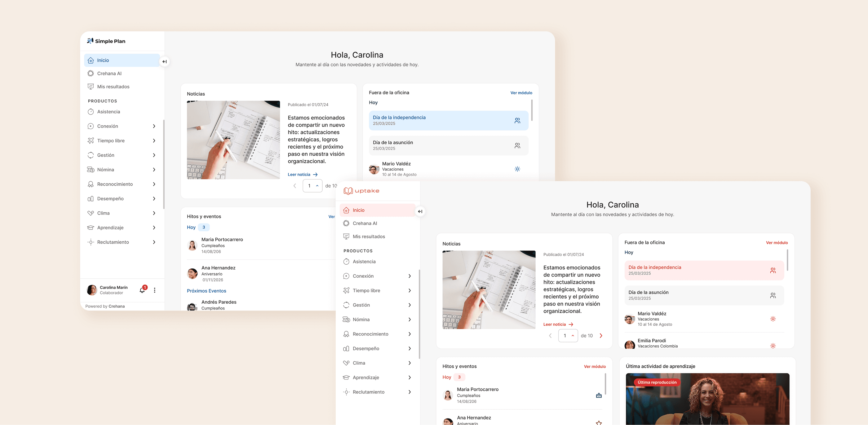
Enterprise customers needed greater control over their visual identity without requiring duplicated components.
The semantic layer became the bridge between the product and each brand, allowing the same components to adapt through token mappings.


Semantic Tokens
→
Brand A
Brand B
→

Same components
→

Same product
Designing Components
for Design + Code
The token architecture was paired with component specifications that connected visual decisions with implementation.
The goal was to make the same component understandable from both a design and implementation perspective. I collaborated with Frontend Engineering to align the token taxonomy and reduce ambiguity during handoff.
Anatomy
Container · Content · Icon · Actions · States

Visual rules
Spacing · Radius · Borders · Typography · Tokens

Behavior
Hover · Active · Disabled · Web / App

Accessibility
ARIA · Semantic markup · Contrast

Designing Components
for Design + Code
The token architecture was paired with component specifications that connected visual decisions with implementation.
The goal was to make the same component understandable from both a design and implementation perspective. I collaborated with Frontend Engineering to align the token taxonomy and reduce ambiguity during handoff.
Anatomy
Container · Content · Icon · Actions · States
Visual rules
Spacing · Radius · Borders · Typography · Tokens
Behavior
Hover · Active · Disabled · Web / App
Accessibility
ARIA · Semantic markup · Contrast
Turning Documentation into an AI Workflow
Turning Documentation into an AI Workflow
As the Design System grew, documentation became part of the infrastructure itself.
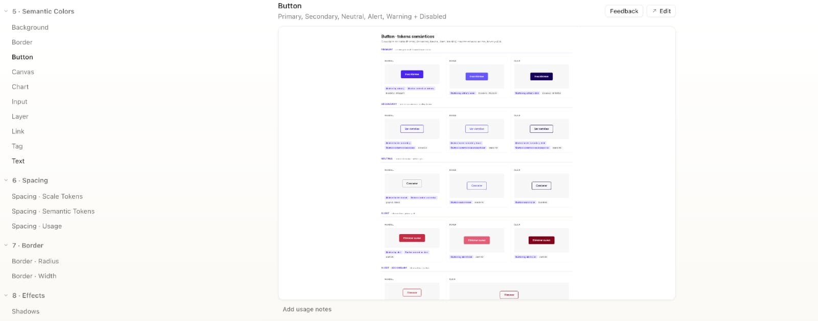
Foundations and component specifications were structured as Markdown files and added to the Design System Library in Claude Design.
As the Design System grew, documentation became part of the infrastructure itself.
Foundations and component specifications were structured as Markdown files and added to the Design System Library in Claude Design.

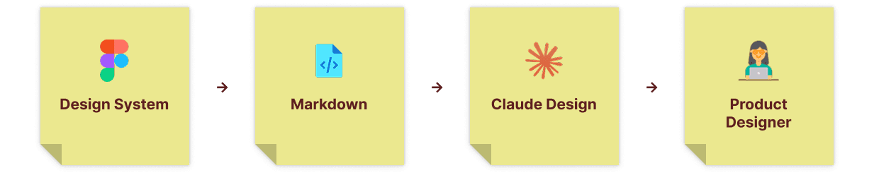

Design System
→

Markdown
→

Claude Design
→

Product Designer
The documentation provided structured context around tokens, components, accessibility, foundations and implementation rules.
Claude Code could then process these specifications and support implementation-oriented workflows.
The documentation provided structured context around tokens, components, accessibility, foundations and implementation rules.
Claude Code could then process these specifications and support implementation-oriented workflows.
Before
Before
Search → Read → Ask → Clarify → Design
Search → Read → Ask → Clarify → Design
After
After
Ask → Retrieve system context → Explore → Review
Ask → Retrieve system context → Explore → Review
The goal wasn't to replace the designer. It was to make the Design System easier to access and use.
AI became an interface to the Design System.
The goal wasn't to replace the designer. It was to make the Design System easier to access and use.
AI became an interface to the Design System.


Impact
The new architecture improved the system at both a product and team level.
Enterprise scalability
Enterprise scalability
Brand customization could be handled through token mappings instead of duplicated component libraries.
Brand customization could be handled through token mappings instead of duplicated component libraries.
Design–Engineering alignment
Design–Engineering alignment
UI Patterns: Empty states
Figma, documentation and implementation followed a shared functional taxonomy.
Figma, documentation and implementation followed a shared functional taxonomy.
Faster handoff
Faster handoff
UI Patterns: Empty states
Structured specifications reduced technical clarification during implementation. Projects that previously required approximately two weeks for design, documentation and handoff could be completed in approximately one week using the new workflow.
Structured specifications reduced technical clarification during implementation. Projects that previously required approximately two weeks for design, documentation and handoff could be completed in approximately one week using the new workflow.
AI-ready infrastructure
AI-ready infrastructure
UI Patterns: Empty states
The Design System became structured enough to serve as context for AI-assisted product design workflows.
The Design System became structured enough to serve as context for AI-assisted product design workflows.
64
64
Primitive tokens
Primitive tokens
Primitive tokens
144
144
Semantic colors
Semantic colors
Semantic colors
43
43
Applied units
Applied units
Applied units
~50%
~50%
Faster handoff
Faster handoff
Faster handoff
The Result
The Result
The Design System evolved from a collection of standardized UI patterns into a shared infrastructure connecting Design, components, code, documentation and AI.
The biggest shift wasn't the number of variables we created. It was building a system where Design and Engineering could work from the same logic while making the product easier to scale.
The Design System evolved from a collection of standardized UI patterns into a shared infrastructure connecting Design, components, code, documentation and AI.
The biggest shift wasn't the number of variables we created. It was building a system where Design and Engineering could work from the same logic while making the product easier to scale.
A Design System is not just a UI library. It's infrastructure for scaling product design.
A Design System is not just a UI library. It's infrastructure for scaling product design.


Did you love
what you saw here?
Did you love
what you saw here?
Drop me a line!
Drop me a line!

Copyright © 2026 Raquel Sedano. All Rights Reserved.
Did you love
what you saw here?
A quick look into my experience, skill set,
and background.

Copyright © 2026 Raquel Sedano. All Rights Reserved.