crehana
design system
crehana
design system
crehana
design system
02
CREHANA
Design System
As the product scaled, the legacy library created friction and UI inconsistencies. I led the design of a modular, scalable Design System for Web and Mobile Apps, prioritizing accessibility (WCAG) and seamless synchronization with Front-end teams.
As the product scaled, the legacy library created friction and UI inconsistencies. I led the design of a modular, scalable Design System for Web and Mobile Apps, prioritizing accessibility (WCAG) and seamless synchronization with Front-end teams.
Role:
Senior UI Designer
Role:
Senior UI Designer
Team:
Senior Designers (2 UI Designers and 1 Product Designer from different teams).
Team:
Senior Designers (2 UI Designers and 1 Product Designer from different teams).
Company:
Crehana, HR Platform
Company:
Project for a MicroDegree in UX Design
Timeline:
2023
Timeline:
2023

How did we start?
How did we start?
To build a truly useful system, we first identified the needs of our internal users: the design team. We facilitated a workshop to map pain points from the legacy library and prioritize key findings across core areas like color, typography, grids, buttons, inputs, and feedback.
To build a truly useful system, we first identified the needs of our internal users: the design team. We facilitated a workshop to map pain points from the legacy library and prioritize key findings across core areas like color, typography, grids, buttons, inputs, and feedback.

Takeaways
🔍
Documentation and visibility:
Lack of clarity on components built outside the core library, resulting in duplicated effort.
Documentation and visibility:
Lack of clarity on components built outside the core library, resulting in duplicated effort.
📁
Architecture and organization:
The page structure of the current design system was unintuitive, making it difficult to find and reuse patterns.
Architecture and organization:
The page structure of the current design system was unintuitive, making it difficult to find and reuse patterns.
📝
Typography scale and hierarchy:
Lack of typographic flexibility. Relying solely on Regular and ExtraBold made the visual hierarchy feel either too heavy or too light, compounded by a limited size range.
Typography scale and hierarchy:
Lack of typographic flexibility. Relying solely on Regular and ExtraBold made the visual hierarchy feel either too heavy or too light, compounded by a limited size range.
🎨
Color and accessibility (WCAG):
Insufficient contrast across several key colors. Need to ensure proper contrast ratios and define optimal combinations for Light and Dark Mode.
Color and accessibility (WCAG):
Insufficient contrast across several key colors. Need to ensure proper contrast ratios and define optimal combinations for Light and Dark Mode.
Toward a Unified Product
Toward a Unified Product
Separate Web and Mobile libraries created an inconsistent user experience. To unify the product, we defined cohesion at the Foundations level and structured the system into 3 modular layers:
Separate Web and Mobile libraries created an inconsistent user experience. To unify the product, we defined cohesion at the Foundations level and structured the system into 3 modular layers:
Foundations (Global): Color, typography, and grids that serve as the product's backbone.
Web Library: Components tailored for desktop interfaces.
Mobile Library: Components optimized for iOS and Android.
Foundations (Global): Color, typography, and grids that serve as the product's backbone.
Web Library: Components tailored for desktop interfaces.
Mobile Library: Components optimized for iOS and Android.


Typographic Evolution:
Typographic Evolution:
Updating the typography was one of the project's most critical visual decisions, focused on addressing legibility and scale issues:
Updating the typography was one of the project's most critical visual decisions, focused on addressing legibility and scale issues:
Replacing Nunito with Poppins: Poppins was adopted as the new secondary typeface due to its geometric strokes—complementing Gilroy—and superior performance in long-form text.
Optimizing Gilroy font weights: Reduced reliance on the ExtraBold variant, which created visual clutter in small buttons and longer phrases, creating a more balanced hierarchy.
Expanding the type scale: Integrated new sizes and weights to provide greater compositional flexibility, directly addressing key workshop findings.
Replacing Nunito with Poppins: Poppins was adopted as the new secondary typeface due to its geometric strokes—complementing Gilroy—and superior performance in long-form text.
Optimizing Gilroy font weights: Reduced reliance on the ExtraBold variant, which created visual clutter in small buttons and longer phrases, creating a more balanced hierarchy.
Expanding the type scale: Integrated new sizes and weights to provide greater compositional flexibility, directly addressing key workshop findings.
Color Evolution and Accessibility (WCAG)
Color Evolution and Accessibility (WCAG)
Accessibility became a core pillar of the new system. We expanded the palette from 4 to 6 shades per color, adding lighter and darker tones to ensure optimal contrast combinations (meeting WCAG standards).
This expansion gives designers greater flexibility and prevents legibility issues when building new components across both Light and Dark Mode.
Accessibility became a core pillar of the new system. We expanded the palette from 4 to 6 shades per color, adding lighter and darker tones to ensure optimal contrast combinations (meeting WCAG standards).
This expansion gives designers greater flexibility and prevents legibility issues when building new components across both Light and Dark Mode.

Misuse of the secondary color negatively impacted global accessibility, as all platform links in Light Mode failed contrast testing.
We resolved this issue by applying the primary color to links in Light Mode while reserving the secondary color exclusively for Dark Mode—achieving an accessible experience without sacrificing visual consistency.
Misuse of the secondary color negatively impacted global accessibility, as all platform links in Light Mode failed contrast testing.
We resolved this issue by applying the primary color to links in Light Mode while reserving the secondary color exclusively for Dark Mode—achieving an accessible experience without sacrificing visual consistency.

💡
Solution:
We replaced this shade with the primary color in Light Mode to guarantee readability, retaining it exclusively in Dark Mode. This rule lays the foundation for a future transition toward a more robust, semantic Design Tokens architecture.
Solution:
We replaced this shade with the primary color in Light Mode to guarantee readability, retaining it exclusively in Dark Mode. This rule lays the foundation for a future transition toward a more robust, semantic Design Tokens architecture.

Formalizing Undocumented Colors
Formalizing Undocumented Colors
We officially integrated a color shade into the library that was already being used recurringly across the platform but lacked documentation in the previous system, eliminating gaps in our UI guidelines.
We officially integrated a color shade into the library that was already being used recurringly across the platform but lacked documentation in the previous system, eliminating gaps in our UI guidelines.

Standardizing Naming Conventions and Semantic Tokens
Standardizing Naming Conventions and Semantic Tokens
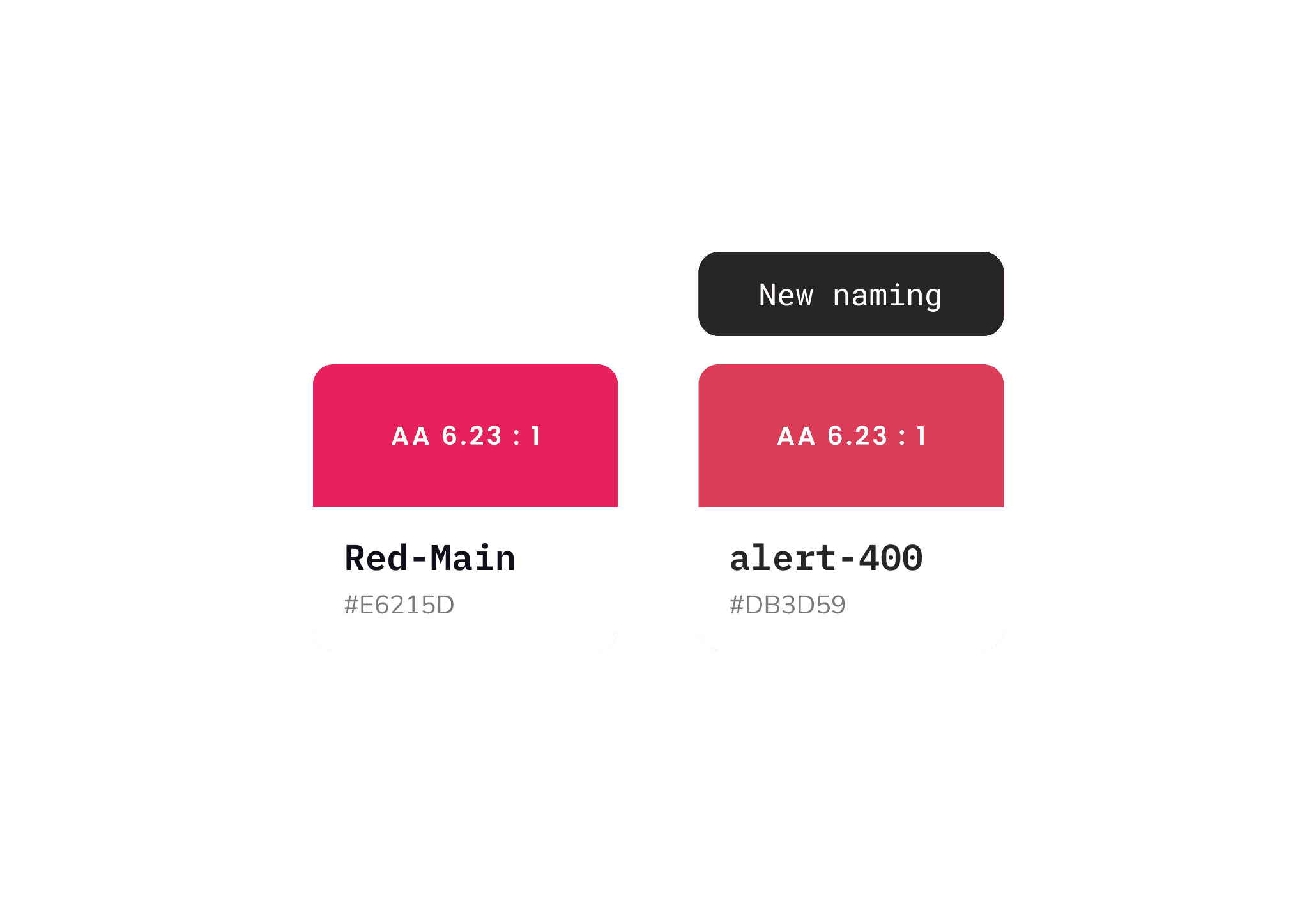
In close collaboration with the Front-end team, we defined a semantic naming architecture to align Figma components with the codebase. Colors were named according to their function within the platform and assigned a numeric scale indicating tone intensity or saturation:
In close collaboration with the Front-end team, we defined a semantic naming architecture to align Figma components with the codebase. Colors were named according to their function within the platform and assigned a numeric scale indicating tone intensity or saturation:
Red-main ➔ alert-400 (Base color for alert messages)
Red-dark ➔ alert-600 (Darker variant for active states or higher visual hierarchy)
Red-main ➔ alert-400 (Base color for alert messages)
Red-dark ➔ alert-600 (Darker variant for active states or higher visual hierarchy)
Impact on Crehana's Rebranding
Impact on Crehana's Rebranding
The strength of our visual foundations reached beyond the digital product. While defining the Foundations (color palette and typography), we collaborated with the Marketing team to test the system's new direction.
Seeing the proposal's consistency and flexibility, Marketing adopted these exact foundations to execute Crehana’s global rebranding—aligning brand communications (social media and marketing collateral) with the new UI experience.


Components
Scalability and Density in Inputs and Dropdowns
Scalability and Density in Inputs and Dropdowns
Previously, inputs and dropdowns featured a single size designed for promotional landing pages, which felt intrusive and oversized when applied to complex workflows within the platform.
Previously, inputs and dropdowns featured a single size designed for promotional landing pages, which felt intrusive and oversized when applied to complex workflows within the platform.
To adapt the component to each environment's density, we defined two key variants:
Small (sm): Optimized for the core product UI, maximizing screen real estate.
Medium (md): Reserved for landing pages and conversion forms.
To adapt the component to each environment's density, we defined two key variants:
Small (sm): Optimized for the core product UI, maximizing screen real estate.
Medium (md): Reserved for landing pages and conversion forms.
In parallel, we refactored the component architecture in Figma (Auto Layout, Component Properties, and variants), making setup much more intuitive for designers.
In parallel, we refactored the component architecture in Figma (Auto Layout, Component Properties, and variants), making setup much more intuitive for designers.

Button Refinement
Button Refinement
Typography update: Implemented Poppins to improve text legibility and vertical alignment.
Corner radius adjustment (Border Radius): Increased corner rounding for a more modern and friendly aesthetic.
Pattern preservation: Key states and interactions were retained to avoid introducing friction to the user learning curve.
Typography update: Implemented Poppins to improve text legibility and vertical alignment.
Corner radius adjustment (Border Radius): Increased corner rounding for a more modern and friendly aesthetic.
Pattern preservation: Key states and interactions were retained to avoid introducing friction to the user learning curve.

Contrast Optimization
Contrast Optimization
Typography update: Implemented Poppins to improve text legibility and vertical alignment.
Corner radius adjustment (Border Radius): Increased corner rounding for a more modern and friendly aesthetic.
Pattern preservation: Key states and interactions were retained to avoid introducing friction to the user learning curve.
Typography update: Implemented Poppins to improve text legibility and vertical alignment.
Corner radius adjustment (Border Radius): Increased corner rounding for a more modern and friendly aesthetic.
Pattern preservation: Key states and interactions were retained to avoid introducing friction to the user learning curve.

Flexibility and Architecture in Dialogs
Flexibility and Architecture in Dialogs
The problem: Dialogs had one of the highest detachment rates across the team. Due to its rigid, static structure, it didn't allow for content customization based on the needs of each user flow.
The problem: Dialogs had one of the highest detachment rates across the team. Due to its rigid, static structure, it didn't allow for content customization based on the needs of each user flow.

Simplification and New Dialog Types
Simplification and New Dialog Types
Following the workshop with the design team, we identified that complex variants went unused and that most use cases required a much leaner structure.
To reduce friction and drive adoption, we simplified the component into two core types:
Basic / Default: For straightforward confirmation messages, alerts, or quick actions.
Custom / Complex: For user flows requiring custom layouts, forms, or interactive content.
Following the workshop with the design team, we identified that complex variants went unused and that most use cases required a much leaner structure.
To reduce friction and drive adoption, we simplified the component into two core types:
Basic / Default: For straightforward confirmation messages, alerts, or quick actions.
Custom / Complex: For user flows requiring custom layouts, forms, or interactive content.

Basic / Default
Used to communicate concise messages, alerts, or confirmations requiring simple interactions or straightforward actions.

Custom / Complex:
Unlike informational dialogs, these are designed for user flows requiring active engagement or complex task completion. Their internal architecture is modular and flexible, enabling the integration of various UI patterns (such as forms, selection controls, or inputs) depending on the use case.
Documentation
Documentation
Documentation and Changelogs: System Traceability
Documentation and Changelogs: System Traceability
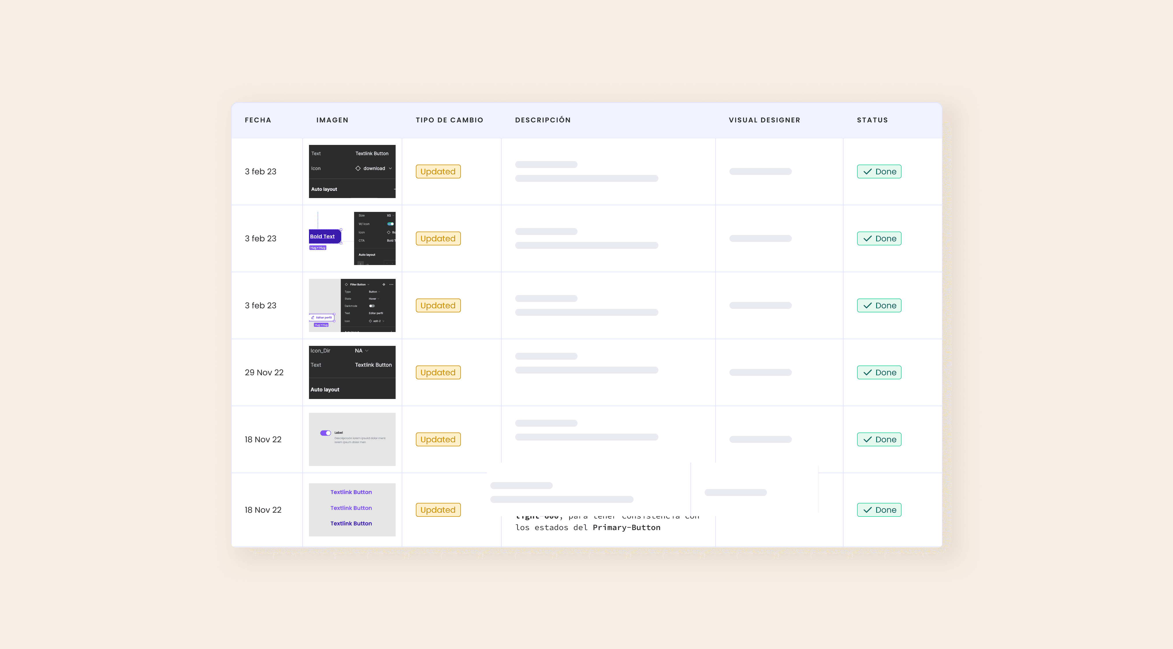
Team growth led to frequent changes in the library without authorship records. We resolved this by integrating component-level Changelogs detailing the date, adjustment, and owner, ensuring transparency and clear version control across design and engineering.
Team growth led to frequent changes in the library without authorship records. We resolved this by integrating component-level Changelogs detailing the date, adjustment, and owner, ensuring transparency and clear version control across design and engineering.
UI Patterns: Empty states
UI Patterns: Empty states
UI Patterns: Empty states
To resolve visual inconsistencies across the platform, we unified Empty States as our first documented UI pattern (covering anatomy, voice & tone, and interaction). This milestone sets the foundation for a modular repository that will keep expanding to align and speed up the team's workflow.
To resolve visual inconsistencies across the platform, we unified Empty States as our first documented UI pattern (covering anatomy, voice & tone, and interaction). This milestone sets the foundation for a modular repository that will keep expanding to align and speed up the team's workflow.

New visual experience
New visual experience


Key Takeaways and Next Steps
Key Takeaways
and Next Steps
With the library foundations consolidated, the next strategic step is the architecture and implementation of Design Tokens and global variables. This will enable automated scaling of themes (Dark/Light mode), spacing, and styles between Figma and code.
With the library foundations consolidated, the next strategic step is the architecture and implementation of Design Tokens and global variables. This will enable automated scaling of themes (Dark/Light mode), spacing, and styles between Figma and code.
Next Step on the Roadmap
Next Step on the Roadmap
With the library foundations consolidated, the next strategic step is the architecture and implementation of Design Tokens and global variables. This will enable automated scaling of themes (Dark/Light mode), spacing, and styles between Figma and code.
With the library foundations consolidated, the next strategic step is the architecture and implementation of Design Tokens and global variables. This will enable automated scaling of themes (Dark/Light mode), spacing, and styles between Figma and code.
competencias

Did you love
what you saw here?
Did you love
what you saw here?
Drop me a line!
Drop me a line!

Copyright © 2026 Raquel Sedano. All Rights Reserved.
Did you love
what you saw here?
A quick look into my experience, skill set,
and background.

Copyright © 2026 Raquel Sedano. All Rights Reserved.