competencies
competencies
competencies
03
crehana
DESKTOP
Assessing competencies means measuring how well someone performs their job to guide hiring and growth. We redesigned the current module—previously complex and frustrating—into an intuitive, high-value tool for the entire organization.
Assessing competencies means measuring how well someone performs their job to guide hiring and growth. We redesigned the current module—previously complex and frustrating—into an intuitive, high-value tool for the entire organization.
Role:
UI Designer
Role:
UI Designer
Company:
1 UX Designer
1 UI Designer
Company:
Project for a MicroDegree in UX Design
Company:
Crehana, HR Platform
Company:
Project for a MicroDegree in UX Design
Timeline:
2024
Timeline:
2024

Research Discovery
Research Discovery
The module’s main job is to enable accurate, objective evaluations for all employees, for both leaders and their teams. Through user feedback sessions and Customer Success reports, we identified recurring pain points that limited the module’s usefulness.
The module’s main job is to enable accurate, objective evaluations for all employees, for both leaders and their teams. Through user feedback sessions and Customer Success reports, we identified recurring pain points that limited the module’s usefulness.
The goal was to gather this feedback and transform it into improvement opportunities, addressing both core friction points and essential details every digital product must guarantee to deliver a clear, seamless experience.
The goal was to gather this feedback and transform it into improvement opportunities, addressing both core friction points and essential details every digital product must guarantee to deliver a clear, seamless experience.
It doesn't let me see pending evaluations.
Comment fields are too small.
Responsiveness issues on certain screen resolutions limit clear visibility for users.
Uncertainty about exactly which competencies are being evaluated.
Design Process
Design Process
Heuristic Evaluation
Heuristic Evaluation
The platform had been acquired from a third-party vendor, resulting in a user experience that felt inconsistent with the rest of our current system. The redesign objective was to unify design patterns so users would experience a cohesive, fully integrated product.
The platform had been acquired from a third-party vendor, resulting in a user experience that felt inconsistent with the rest of our current system. The redesign objective was to unify design patterns so users would experience a cohesive, fully integrated product.

Research Plan
Research Plan
Based on the pain points and feedback received, several structural proposals were created for the main evaluation screen, as it concentrated the highest number of issues.
The plan consisted of:
Generating improvement proposals and developing interactive prototypes.
Based on the pain points and feedback received, several structural proposals were created for the main evaluation screen, as it concentrated the highest number of issues.
The plan consisted of:
Generating improvement proposals and developing interactive prototypes.

Define key tasks in the prototypes, such as evaluating an employee or leaving a comment.
Validate proposals through usability testing in Maze, combining user interviews to gather qualitative insights with interaction metrics for quantitative data.
Define key tasks in the prototypes, such as evaluating an employee or leaving a comment.
Validate proposals through usability testing in Maze, combining user interviews to gather qualitative insights with interaction metrics for quantitative data.
This created a qualitative evaluation backed by quantitative data, allowing us to measure the effectiveness of each proposal and understand the user experience throughout the evaluation flow.
Users: Team Leaders and HR Managers (internal and client companies using the current module).
Sample: 15 interviewees.
This created a qualitative evaluation backed by quantitative data, allowing us to measure the effectiveness of each proposal and understand the user experience throughout the evaluation flow.
Users: Team Leaders and HR Managers (internal and client companies using the current module).
Sample: 15 interviewees.


Usability
Usability
At the end of each interview, we applied the SUS (System Usability Scale). The average score was 85.5, which is considered an excellent level of usability and confirms that the proposed solution was easy for participants to understand and use.
At the end of each interview, we applied the SUS (System Usability Scale). The average score was 85.5, which is considered an excellent level of usability and confirms that the proposed solution was easy for participants to understand and use.


Pantallas adicionales

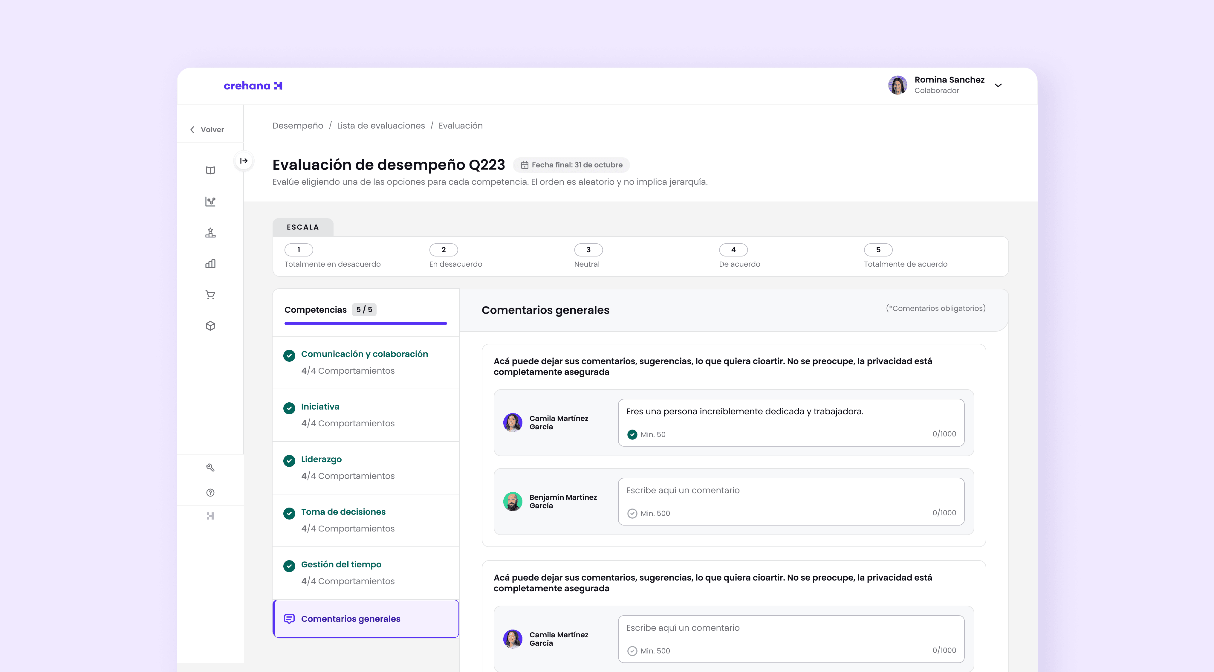


Final design
Final design
Improvements in the Proposal
Improvements in the Proposal
The final proposal was built on the research plan: user interviews, prototype testing, and feedback gathered from participants.
These insights guided design decisions, resulting in a clearer, more consistent module aligned with the real needs of leaders and HR teams.
The final proposal was built on the research plan: user interviews, prototype testing, and feedback gathered from participants.
These insights guided design decisions, resulting in a clearer, more consistent module aligned with the real needs of leaders and HR teams.

Current Module Screen
Evaluations Table
Evaluations Table
🚨
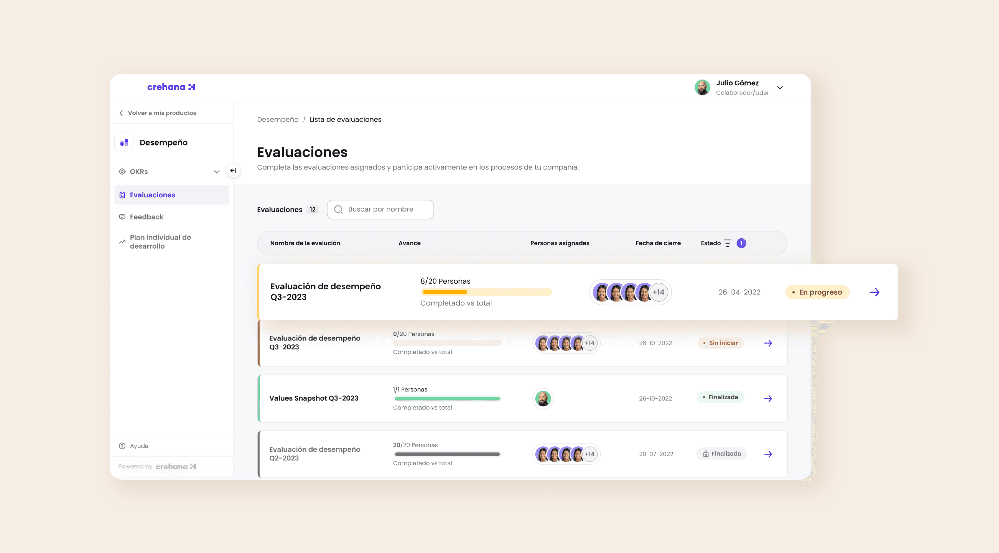
Pain: It doesn't let me see pending evaluations.
Pain: It doesn't let me see pending evaluations.
💡
Solution:
A status column was added, and the active evaluation appears first so employees can easily identify it. Additionally, the table displays relevant data such as assignees, progress, and the total count of pending evaluations.
Solution:
A status column was added, and the active evaluation appears first so employees can easily identify it. Additionally, the table displays relevant data such as assignees, progress, and the total count of pending evaluations.
Comments
🚨
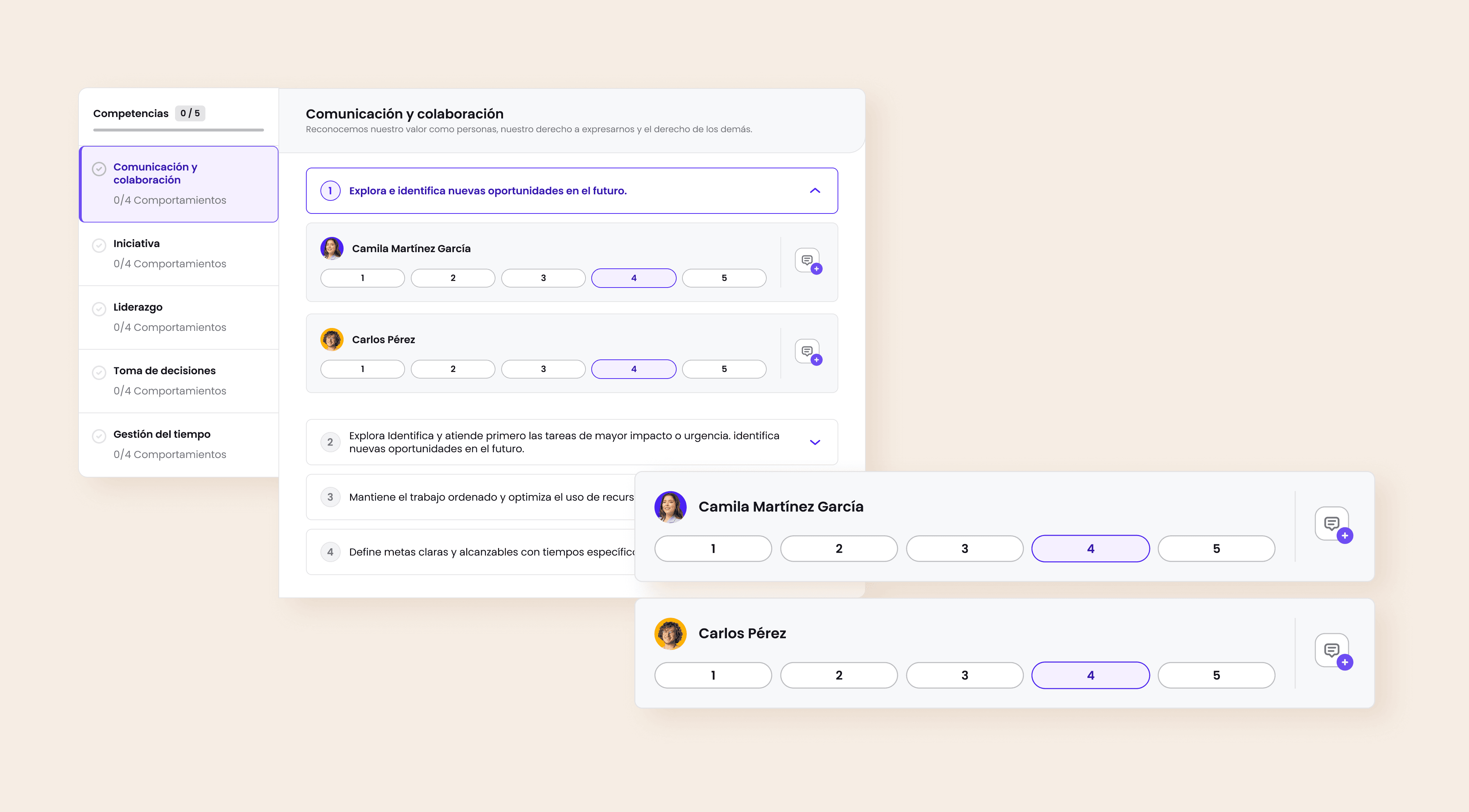
Pain: Comment fields were too small, and when evaluating multiple people at once, the boxes piled up and felt uncomfortable to use.
Pain: Comment fields were too small, and when evaluating multiple people at once, the boxes piled up and felt uncomfortable to use.
💡
Solution:
Added a speech bubble icon that opens a larger, dedicated comment box for each evaluated person.
This allows for comfortable writing and helps focus on one employee at a time.
Solution:
Added a speech bubble icon that opens a larger, dedicated comment box for each evaluated person.
This allows for comfortable writing and helps focus on one employee at a time.

Responsiveness & Layout
Responsiveness & Layout
🚨
Pain: The platform didn't adapt well to wide screens. Users were displayed in a horizontal layout, which reduced available space: cards became narrow, evaluation scale ranges (0 to 10) broke the structure, and the interface felt cluttered.
Pain: The platform didn't adapt well to wide screens. Users were displayed in a horizontal layout, which reduced available space: cards became narrow, evaluation scale ranges (0 to 10) broke the structure, and the interface felt cluttered.
💡
Solution:
Redesigned the structure into a vertical layout, providing more breathing room per user, better legibility for evaluation ranges, and a clear dedicated area for comments, achieving a cleaner and more comfortable experience.
Solution:
Redesigned the structure into a vertical layout, providing more breathing room per user, better legibility for evaluation ranges, and a clear dedicated area for comments, achieving a cleaner and more comfortable experience.
My Competencies
My Competencies
🚨
Pain: Not knowing exactly which competencies are being evaluated or the current progress.
Pain: Not knowing exactly which competencies are being evaluated or the current progress.
💡
Solution:
Incorporated a sidebar menu with the complete list of competencies and a progress counter (e.g., 3 of 5 completed). Clicking any competency jumps directly to its section, while a visual checkmark confirms completed evaluations for full clarity on progress.
Solution:
Incorporated a sidebar menu with the complete list of competencies and a progress counter (e.g., 3 of 5 completed). Clicking any competency jumps directly to its section, while a visual checkmark confirms completed evaluations for full clarity on progress.

Aditional screens
Conclusions and Learnings
Conclusions and Learnings
The redesign transformed a legacy module into an intuitive tool consistent with Crehana's ecosystem. Focusing the UI on legibility, visual hierarchy, and reducing cognitive load was key to driving system adoption—validated by a SUS Score of 85.5. This project strengthened my ability to translate qual/quant research into scalable B2B visual solutions.
The redesign transformed a legacy module into an intuitive tool consistent with Crehana's ecosystem. Focusing the UI on legibility, visual hierarchy, and reducing cognitive load was key to driving system adoption—validated by a SUS Score of 85.5. This project strengthened my ability to translate qual/quant research into scalable B2B visual solutions.
travel gals

Did you love
what you saw here?
Did you love
what you saw here?
Drop me a line!
Drop me a line!

Copyright © 2026 Raquel Sedano. All Rights Reserved.
Did you love
what you saw here?
A quick look into my experience, skill set,
and background.

Copyright © 2026 Raquel Sedano. All Rights Reserved.